|
 |
|
|
|
| Thread title: [ENDED] $40 logo/brand contest |
 |
|
| Page 2 of 7 |
< |
1 |
2 |
3 |
4 |
5 |
6 |
> |
|
| |
|
 Thread tools
 Search this thread
 Display Modes
|
|
|
01-01-2006, 12:44 AM
|
#11
|
Status: Member
Join date: Jan 2005
Location: Northern California
Expertise:
Software:
Posts: 349


|

Something to kick off this contest with. Supposed to be working on another project, so ill get some more work into this contest a little later.
*removed*
|
|
|
|
01-01-2006, 12:50 AM
|
#12
|
Status: Senior Member
Join date: Jul 2004
Location: Vegas
Expertise:
Software:
Posts: 929
|
|
|
|
|
01-01-2006, 01:59 AM
|
#13
|
Status: Community Archaeologist
Join date: Jul 2004
Location: Scotland
Expertise: Software Development
Software: vim, PHP
Posts: 3,820
|
I was going to post something to get the ball rolling, so to speak, but SoReal got in there first! Enjoy.  Kindly hosted by Robson:

|
|
|
|
01-01-2006, 09:42 AM
|
#14
|
Status: Member
Join date: Oct 2005
Location: Derby, England
Expertise: Graphic/Web Design
Software: Photoshop CS3
Posts: 325
|
Here's something from me, i haven't added the slogan yet, i wanted to see if you liked the concept first.

|
|
|
|
01-01-2006, 02:04 PM
|
#15
|
Status: I'm new around here
Join date: Nov 2005
Location:
Expertise:
Software:
Posts: 13
|
SoReal : I like so far, buy dont like the star in the "a".
Salathe: Its a bit stargate sg1 but I do like the font you used.
NeiL: I like the idea of representing the "A" with a star but its not quite there yet maybe you could play about with that idea ??
|
|
|
|
01-01-2006, 02:20 PM
|
#16
|
Status: Member
Join date: Oct 2005
Location: Derby, England
Expertise: Graphic/Web Design
Software: Photoshop CS3
Posts: 325
|
here's a slight update

Do you like the font?? im not too sure if it looks right 
|
|
|
|
01-01-2006, 03:11 PM
|
#17
|
Status: I'm new around here
Join date: Nov 2005
Location:
Expertise:
Software:
Posts: 13
|
|
Originally Posted by NeiL
Do you like the font?? im not too sure if it looks right
|
I'd prefer not to use serif fonts, Salathe has got the font about right
|
|
|
|
01-01-2006, 11:59 PM
|
#18
|
Status: Member
Join date: Jan 2005
Location: Northern California
Expertise:
Software:
Posts: 349
|
Another mockup. Working on text/font variations. Let me know.
|
|
|
|
01-02-2006, 12:24 AM
|
#19
|
Status: Community Archaeologist
Join date: Jul 2004
Location: Scotland
Expertise: Software Development
Software: vim, PHP
Posts: 3,820
|
Hey again,
I can certainly understand the 'stargate' idea, so I've adopted a different approach whilst keeping the typography. NeiL, if you don't like my use of the 'stroked star' then yell at me. I chose that over a solid one purely for artistic reasons (the 'weight' of the logo).
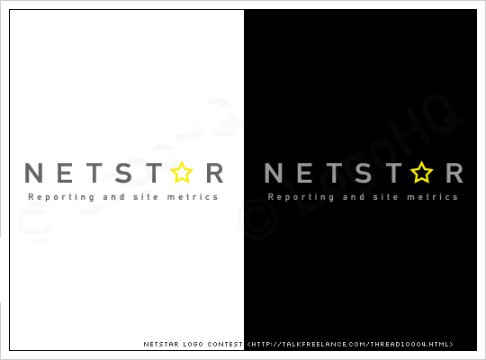
Cheers,
Salathe
|
|
|
|
01-02-2006, 02:53 AM
|
#20
|
Status: Junior Member
Join date: Mar 2005
Location: UK
Expertise:
Software:
Posts: 81
|
heres myne:

|
|
|
|
|
|
|
|
| Page 2 of 7 |
< |
1 |
2 |
3 |
4 |
5 |
6 |
> |
|
|
Currently Active Users Viewing This Thread: 1 (0 members and 1 guests)
|
|
|
|
|


 Linear Mode

 Forum Contains New Posts
  Forum Contains No New Posts
  Forum is Closed