Thanks for getting it started Salathe.

Here would be my concerns with this one:
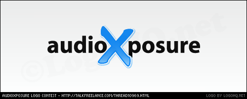
1. I think the shade of blue is probably a little too light to compliment the rest of the site. Also, being so light blue might make it look a little washed out on a white background when we do stickers, tees, etc.
2. I'm also not crazy about that font. And when we write the name of the webzine, we usually write it with a capital A and X. (AudioXposure.com) Sorry I didn't mention the capitalization earlier.
Nice entry to get it rolling. Thanks again!
Jenn


 Linear Mode

 Forum Contains New Posts
  Forum Contains No New Posts
  Forum is Closed